Village Green
Buckley Gray Yeoman
Representing the next chapter of their story, Buckley Gray Yeoman were keen to capture a clear voice within the architectural industry and invigorate the practice with a positioning to best reflect their design philosophy.
Nurturing their reputation for uncovering unanticipated opportunities, our rebrand positions the company around the culture of creative thinking that lies at the heart of the practice.


We created a BGY acronym to promote character and familiarity, with a new wordmark to underpin the identity system and reflect the heritage of the organisation.


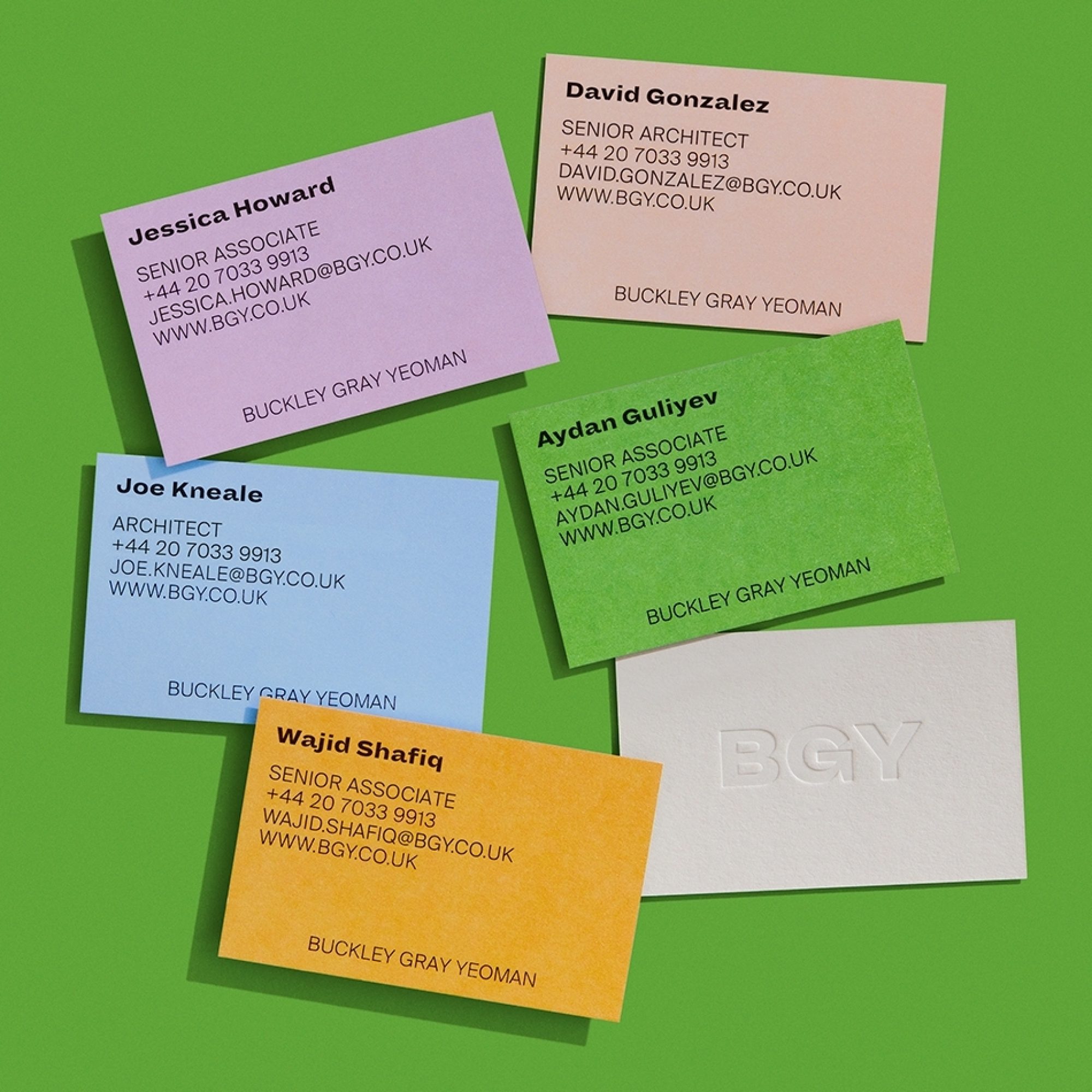
The rebrand seeks to embody Buckley Gray Yeoman architecture – unapologetically joyful and surprising, while also capturing their approach: an architectural practice that behaves like an agency.


Challenging the grid-focused presentation common within the industry, we employed a conversational balance of typography, layout and colour to establish an engaging editorial direction for the practice.

- Client: Buckley Gray Yeoman
Showcase
TitleClientSector


